Posts

Showing posts from September, 2016

Academic Shoot Review and Critique

1. It was really hard to find things to shoot. There weren't a lot of academic classes that weren't busy, and it felt really uncomfortable to shoot quiet classes with the camera noises. It was also hard to get people not look at the camera. 2. I was thinking mostly about rule of thirds and simplicity. Because, they seem like some of the easiest and most fun to find it was the ones I was focused on. To get simplicity I looked for a subject that was near a simple background or that I could make look like a simple background, and to get rule of thirds I just moved the camera to the side and up and/or down. I could not get framing because I did not have enough time. 3. I would like to have been more brave to go into classes, and I would have liked to move my camera/position more to accomplish what I wanted. 4.I don't think I would do anything the same because I didn't like his the shoot turned out. 5. I think that rule of thirds and simplicity will be the easiest to fol

DSLR simulator

Aperture settings available: 2.8, 4, 5.6, 8, 11,16, 22 Shutter speed settings: 1sec, 1/60sec, 1/4000 sec ISO settings available: 100, 200, 400, 800, 1600, 3200, 6400, 12800, 25600

ISO

Image
ISO 200 ISO 3200 1) When you're at a sports game, there is most likely a lot of action, so to be able to capture the picture without blur in the movement, you should use a higher ISO. 2) The author suggested that when you have enough light you should use the lowest ISO to get the highest mage quality you can. 3) The author suggested using a higher ISO when there is low light quality and/or a lot of movement in the photo.

Shutter Speed

Image
high shutter speed low shutter speed 1) a)low shutter speed b)low shutter speed c)high shutter speed d)high shutter speed e)low shutter speed maybe to show movement f)low shutter speed maybe to show movement a)high shutter speed b)high shutter speed c)high shutter speed d)high shutter speed e)high shutter speed f)high shutter speed 2) One of the settings the camera has regarding shutter speed in automatically through in-camera metering.When the camera in on Auto mode, the camera while select the shutter speed for you along with the aperture. Also, there are two more ways to set your shutter speed manually. When you set the camera to "shutter priority", you choose the shutter speed while the camera chooses the aperture. When you set the camera to "manual", you select both the aperture and the shutter speed.

Aperture

Image
F2.8 F16 1) We should closely relate Aperture to the eyes because they both use light, shrink, expand, blur, etc. 2) The smaller the Aperture the larger the F-stop, and the larger the Aperture the smaller the F-stop. 3) The Aperture impacts the Depth of Field by blurring the background and making the object(s) in the foreground more prominent. If the F-stop is smaller the background will be more blurred than with a larger F-stop.

Photo Manipulation and Ethics

Image
A. One o the main points I read in the text was that editing and manipulating photos to a point and alter the truth to a photo. Also, over the years, just about anyone can photoshop to fit current standards. Another point is that is becoming harder and harder to see the changes mad to a photograph. Also, photo ethics are always changing. B. Newspapers like The New York Times have philosophies on labeling things, and relying on memory. C. I think it is unethical to alter photos to change someones body, cutting out people, and necessary thing to tell the truth. I think is is okay to maybe make the picture easier to see, or alter the color and cropping out unnecessary items. D.I think that this is the most unethical manipulation of a photo because it alters the truth. The university stated that they could not find any photos that showed diversity in race. To make the university more attractive to people, they edited in a person of color. I think it lies to the viewers

Academic Shoot

Image
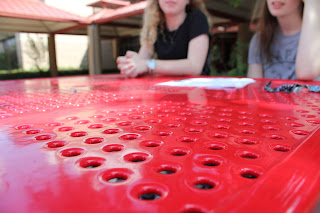
The composition rule is lines.I tried to make the subject be the lines leading towards the girls.  It is probably difficult for people to find the subject because the background is too blurry. I could have angles the camera better to show what the lines lead to. The composition rule was balance. I tried to make the subject the girl. It is probably a little hard to tell what the subject is because of the book. I could have moved the book out of the frame. The rule was simplicity. The subject are the girls. It is probably easy to tell what the subjects are because the background is not enticing. I still would have taken the last girl out of the photo because she was not looking at the camera. The composition rule was rule of thirds. The subject is the computer screen. I think that it is pretty sill to see the subject, but I would have like to have that left arm taken out of the frame. The photo is a merger. I think that this is a good example of a merger because the ba

Great Black and White Photographers pt.2

Image
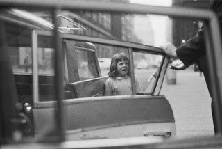
The black and white photographer I chose is named Joel Meyerowtiz. He was born on March 6, 1938 in The Bronx, NY. He is currently 78 years old. He attended Ohio State University, City University of New York, and Hunter College. He began as a self-taught street photographer, and he worked freelance. He shot mostly in New York City to capture his cultural landscape with a 35mm camera. Joel shifted between black and white and color photos. His first book, called Cape Light , is a photographic essay published in 1979. It has sold over 100,000 copies. He has taught photography in several universities across the U.S. Is woe had been displayed in over 350 exhibitions nationwide. He has won several awards including National Endowment for the Arts and the National Endowment for the Humanities. Meyerowitz is also the recipient of two Guggenheim Fellowships. (https://www.artsy.net/artist/joel-meyerowitz and http://www.artnet.com/artists/joel-meyerowitz/biography) New York, 1963 NYC New

Academic Shoot Preview Assignment

1. I liked the photo called "Political Secrets" where a woman and an older man whisper to each other in a dark room with only the american flag visible. I like this photo because you can draw infinite conclusions and stories from the story. 2. There is obviously rule of thirds because of the placement of the subjects, and simplicity because of the dark background. 1. I think that it would be interesting to try and shoot in classrooms with labs and fun experiments going on. 2.I would like to visit my teacher's classrooms to see what other classes are like, and also elective classes to be able to see what they do and learn. 3.I will try to follow the guidelines/rules to get a better quality picture, but also get some action mixed in with the still pictures.

Filling the Frame

Image
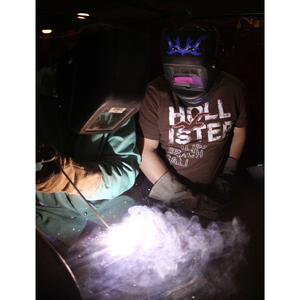
I think that this photo fill the frame the best. I believe that the students are conducting a project , but what makes the photo so cool is the black background and the students with the masks. I also like how the purple smoke is projected onto the students face mask.

Action and Emotion

Image
I think that this picture shows the most emotion. This picture kind of shows the willingness of the students to help. I think that this is a food drive for the less fortunate because the  students are passing out food to people. The less fortunate seem humble, too.

The Story

Image
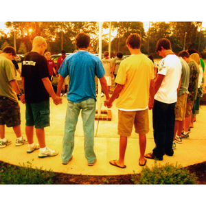
I think that this photo shows the best story. We don't exactly know what is going on, but I think that the students are praying,. I drew this conclusion because the sun seems to be rising/setting and they are holding hands wight their heads down. The picture gives a peaceful and quiet feeling because of the light and lack of action in the people.

Post Shoot Reflection

1. It wasn't too difficult to find what made me happy, but i didn't want to do something basic. I wanted to look at things from a different perspective. I didn't know what made me happy, but when my friends walked by us I just took the photo. Metal was a little harder but I thought of the first artist to paint a tree from a completely different view, and I asked, myself why couldn't I do that? I already knew what to do for Bowie because Bowie wouldn't be Bowie if there weren't amazing people here. 2. I tried holding the camera up even though it wasn't the most comfortable position. I also had to half-bend my knees to get a good photo of the people. I had to refocus a couple times and move to get the camera to focus on what I wanted it to. I was thinking of what I could do to get the focus I wanted. 3. I would probably try to get the people from more interesting angles, and try to frame my photos more evenly. I also like the rule of thirds, so I would proba

Mergers

Image
I think that this is a good example of what you shouldn't do when you are trying to avoid mergers. Yes, this picture shows the action that was happening in the moment, but the focus is terrible and the people all seem to merge into one. There is no fine line between the light and the wall and the people.

Framing

Image
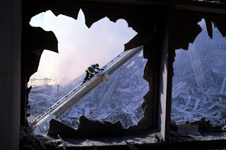
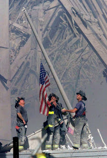
I think this picture shows framing and foreground. The dark, jagged, sort of frame-like foreground points the viewer's attention toward the most important part of the photo, the fireman.Also, the background his simple so it makes the fireman more prominent.

Balance

Image
I think this photo is balanced because of the shape that the firemen and the flag make. The triangle sort of shape they make and the simple background is more pleasing to the viewer than a bunch of people trying to hoist up a skinny flag.

Lines

Image
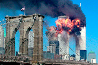
I think this photo shows lines because of the diagonal bridge supports. The diagonal lines not only make the photos more interesting, but they add more of a dynamic view. Using the rule of thirds in this photo, the viewers attention not only goes to the background, but it also goes to the intricate pattern of the lines. The lines also seem to point to the main disaster.

Rule of Thirds

Image
I think this photo shows the rule of thirds because of where the main focus is. When you separate the photo into a gird of three columns and three rows, the man is is more in the upper left corner. The background may not be very simple, but your attention immediately goes to the man. The picture is also more interesting because you can see the background action and the man.

Simplicity

Image
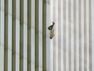
I think this photo shows simplicity because of the background. When you see this photo, your focus goes to the man in the middle of the picture, not only because he's falling, but because he is the complex part of the photo. By having a plain background like this photo, you are able to just focus on the man.

Prompt Shoot #1

Image
Happy: rule of thirds Metal: rule of lines Bowie: Square:

The Camera

1) The camera obscura effect is an optical effect. You can achieve this effect in a completely dark room using a hole in the wall and a light . The hole acted as a lens when the light was focused and the  outside image was projected upside down on the wall. It was the first camera. 2) Isaac Newton and Christian Huygens got a better understanding of optics, and learned how to make higher quality lenses to make a better camera. 3) In 1827 , Joseph Nicephore Niepce added film to create the first successful photograph. He used a glass lens, a dark box, and a film. 4) Modern cameras still have some of the same features as the old ones. Light still has to pass through the lens and into the camera, and the end result is still a photograph. 5) More modern digital cameras use an electronic sensor called a CCD. The photographs are then stored on a reusable computer memory device. It makes the cameras cheaper and more environmentally friendly! 6) In manual camera mode, the photographer has t